Stone, ink, a lasting mark.
Kitabe: a design language drawn from Shibagency’s scenes.
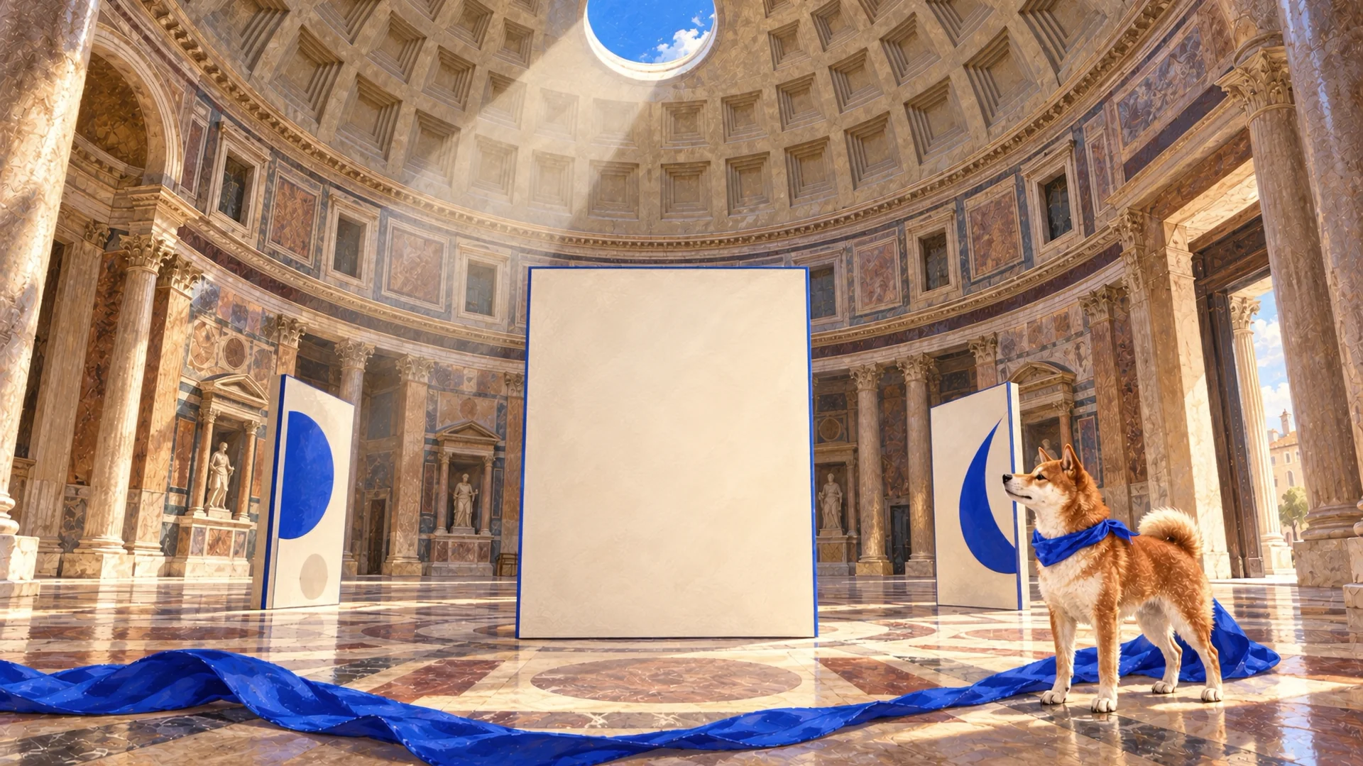
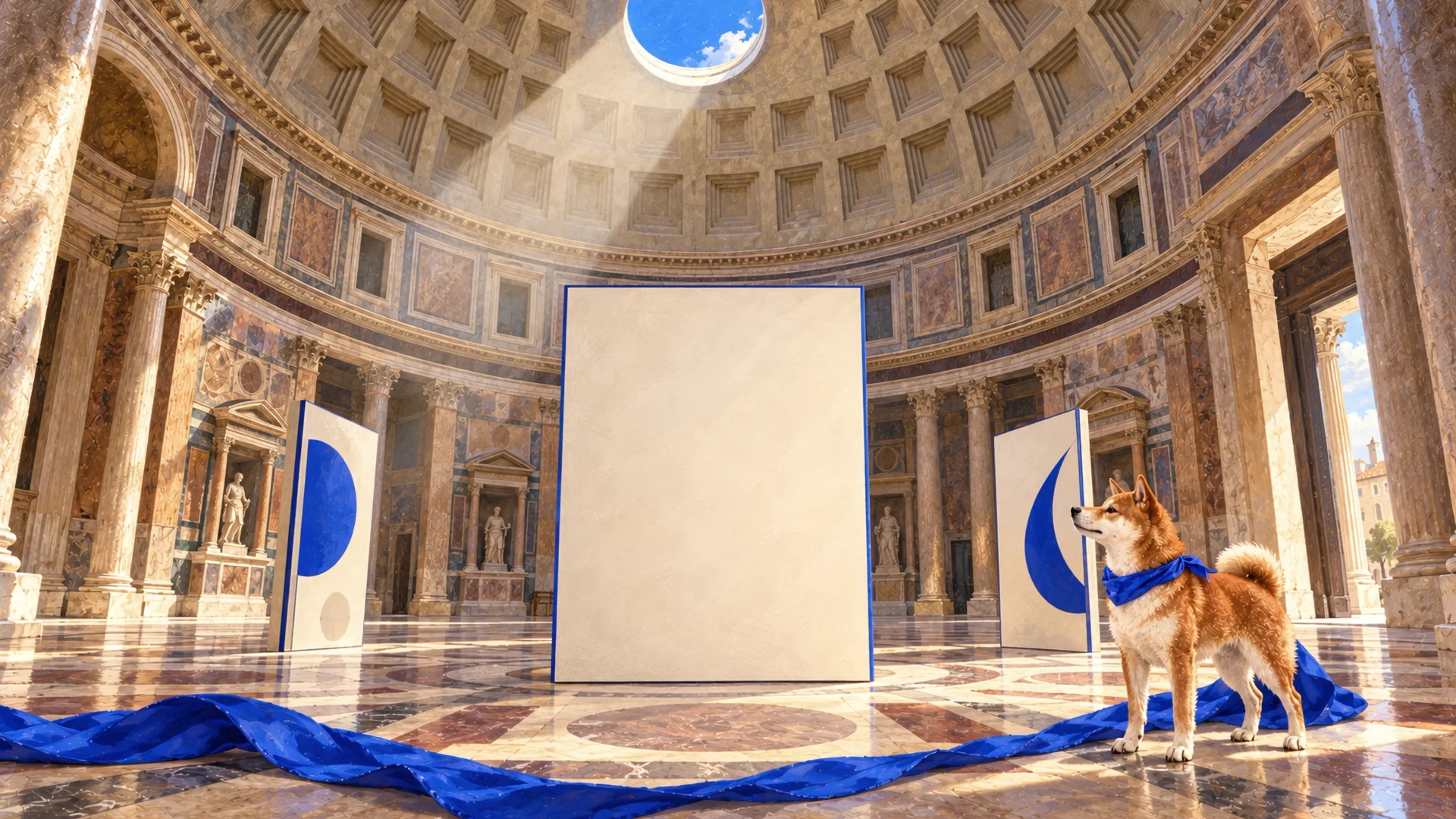
Kitabe is the design direction behind Shibagency’s interface. Its starting point is the cobalt-edged exhibition panel in the Pantheon scene: a material found inside the scene becomes a language for the whole experience.
What a material can say
The warmth of stone, the depth of ink and the lightness of mineral glass. Text surfaces follow the light and architecture of each scene. In the Pantheon, lettering sits on the physical panel; in Kyoto, a light glass surface creates a reading area.
The mark of cobalt
Cobalt appears on edges, small registration marks, fine rules and active states. This repeated mark gives different surfaces a shared family resemblance.
Small breaks in the rules reinforce the sense of material. Clean lines remain where information needs clear separation, including catalogue rows and form fields.
The voices of headline and detail
Fraunces gives headlines a spacious, calm voice. Instrument Sans carries descriptions and controls. Italic emphasis brings forward a meaningful part of a sentence. Turkish and English are considered individually within the same composition, with line breaks responding to the length of the words.
One idea. Many expressions.SHIBAGENCY